CVS x KAGRO Building
The KAGRO Building rebranded for CVS.


Prompt
Baltimore, as a city, has a lot of food deserts and lack of medical attention. Going to school in the area taught me a lot about how apparent these types of problems are in certain areas, as it was hard for me to get food without going well out of my way. Same goes for pharmacies or medical resources, as just like food sources, its hard to find one without going far out of your way. As such, I wanted to bring a merge of both of those needs in the form of CVS into an area that is particularly lacking in pharmaceutical help. While CVS isn't a major food source, it still alleviates some of the issues.
Reference Photos. Images from various sources.


The KAGRO Building, which was once the Maryland National Bank, is a landmark in Baltimore and is in a place that is sorely in need of pharmaceutical help. Due to the structure of the building, it also fits into the architecture style of most CVS buildings that exist already. At the time, it was very modern, but now it fits into the general landscape of modern architecture. This modern, clean design also fits with CVS' branding as a modern, clean company. But as I will be rebranding the building for CVS, I will also be shifting some designs and assets that CVS has that I feel are being underutilized.
Branding / Architecture
CVS Branding / Building Designs. Images from various sources.


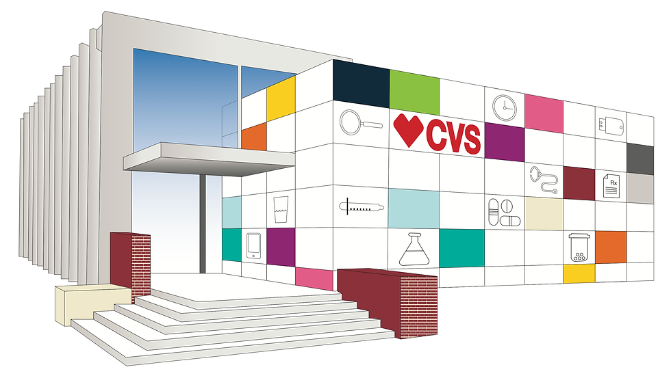
Early Designs: Exterior
I came up with three initial ways to deal with the exterior of the building. One used the traditional design philosophy of CVS, which had the building look dull; the second used the iconography of CVS to be showcased on the front of the building inside of the natural grid structure made by the slabs; the third was utilizing the bright color pallet that CVS has but doesn't use to brighten the already dull building. What I settled on was a combination of the iconographic and colorful styles to bring a little more life to the building and the area that surrounds it.


Initial Mural Designs
Along with the front of the building, the side of the building fits in with CVS' brick style. The side has a lot of glass panels to bring light into the rest of the building, as it is quite small. Of the two ways I could utilize the windows, either as clouded like most CVS' or as a one way glass mural, I wanted to go with the latter. My plan is that the mural could be commissioned by this specific CVS to local artists, which would rotate on a tri-monthly basis. In the initial exterior designs I didn't think of it, but after including a place to showcase a slideshow of the artist working on said mural I included it in the front.


Interior Design / Wayfinding
What I found while doing this project was that CVS has a surprisingly bright color pallet and very interesting iconographic library, but they don't often seem to use it. What I did with this was first, integrate the color more in not just the isle wayfinding but also in the wall graphics, and second, to use the iconographic language that exists in a more prominent way. The wayfinding of the isles was made brighter and integrated the logo of CVS, being the heart, while also using the iconographic language as a pattern that exists in a small yet notable way. The wall graphics also reflects the same style as the wayfinding.

