Elden Quest
Hypothetical App to Enhance the Experience of Elden Ring.


Prompt
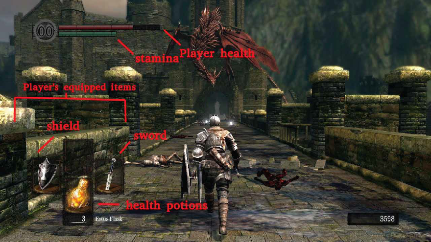
In 2022 the video game developer FromSoftware came out with their biggest hit yet, Elden Ring. While this game has since become a massive success, it is hindered by one problem for new players that its spiritual predecessor (the Dark Souls series) also suffers from: a questline tracker. Players may forget where they are supposed to go next, and with a game as complex and filled with small features as this, may become overwhelming for someone who is playing one of these games for the first time. As such, I decided to make a hypothetical that that could solve this issue for beginners.
Images from various sources.


Ideation
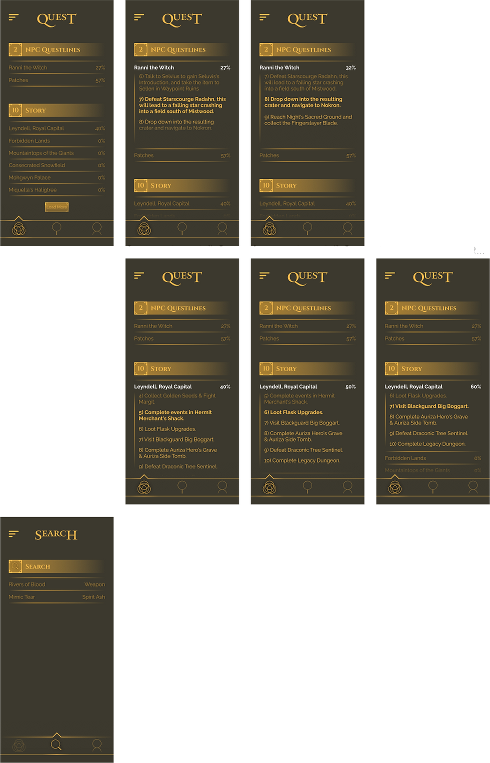
The core of the app needs only three functions: a quest screen, a search screen, and an account linking screen. The quest screen will automatically track your existing quests, the search screen will be to add quests for certain items and content in the game, and the account linking screen to connect your game to the app. For the the ideation, I went with two potential directions, one focusing on a newer approach and one that focuses on using a look similar to the in game graphic system. I decided to go with the latter so that users would have an easier time going back and forth between the two.


Redesigns
Using the style guide I made for myself, I went with a more ornate look for the first iteration, initially using an Old Style font. The search section was also rather bare bones, providing little to no detail. Based on the feedback I received and further research, I replaced the Old Style font with a Sans Serif font in the second iteration. This ultimately seemed to be a better choice for usability due to industry standards. The Search section was also overhauled so that it would provide more information. In the third iteration I increased the size of some of the text for easier readability and added account linking.
